There's been a lot of buzz lately about the
Brushes iPhone app. It is used by
David Hockney, was used to generate a cover for the
New Yorker and has a bunch of interesting images created with it in a
Flickr pool e.g., this one.

I certainly think it has potential, but I haven't warmed to it yet (too busy working on a sculpture, which will hopefully be the subject of my next post).
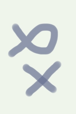
One thing that I found interesting is that it's treatment of brush overlap was more like Photoshop than a painting program. Namely if you cross over a line without lifting your "brush" (finger in this case) it does not increase the intensity of the line at the point of intersection, unlike the painting programs I'm used to (primarily Corel painter).
Example
Brushes
Painter Pro.
This is probably a good way for brushes to work, since as far as I can tell it would otherwise be hard to create an arbitrary area of uniform color, but it did throw me off on my first attempt.

